We have received a lot of questions about our mobile capabilities lately, so I thought I would record some of our thoughts on the subject here on our blog.

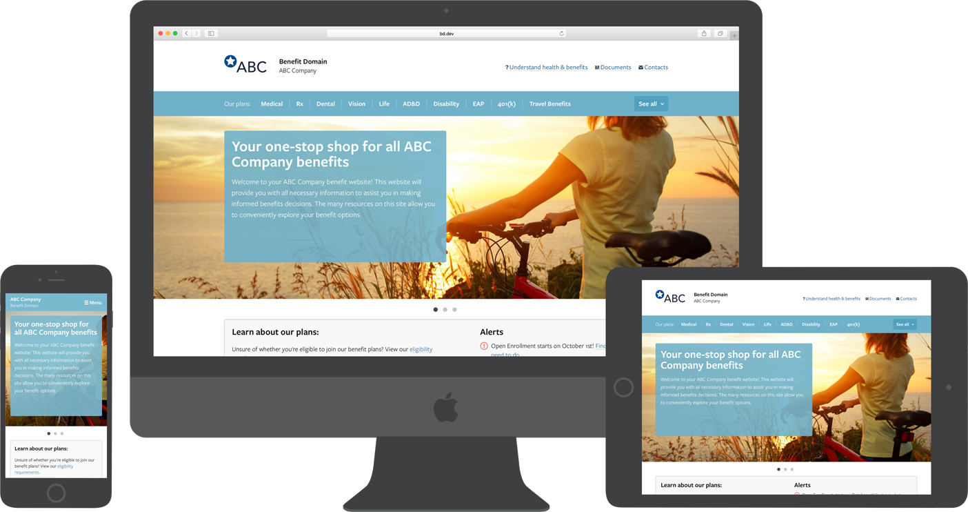
At Benefit Domain, our benefit website platform is our mobile solution. It is also our desktop solution...and our tablet solution! From the very beginning, we have built our benefit websites using what the web industry calls Responsive Web Design (RWD).
Responsive Web Design is an industry best practice because it only requires that you build and manage one website while guaranteeing that it is accessible and optimized on all devices (mobile, tablets, desktop) and platforms (Windows, MacOS, iOS, Android).
A Mobile-First Approach
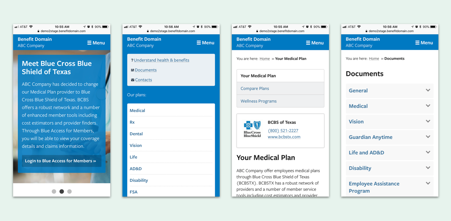
Since day one, our websites have been designed with a “mobile-first” approach. Which means, we design for the smallest screens first and work our way up to larger screens. The result is a fully optimized website for mobile phones and a fully optimized website for tablets and desktop browsers. The site layout adapts based on the width of the screen or browser window. The layout changes, but the features and content of the site never change and are always available to employees.
Responsive Web Design vs. Mobile Apps
Mobile apps are great. They are fast, reliable and easily accessible from your phone's home screen, but they also have some downsides when compared to a responsive website.
Pros of a Mobile App
- Fast and reliable
- Quick access on user's home screen
- Information can be locally stored on your phone for offline access (this is not always the case and is dependent on how the app is built)
- Push notifications can be used to reach users with important messages
Cons of a Mobile App
- Apps are mobile-only and require you to build for multiple platforms (Android and iOS), which drives up the development costs, especially if done at a high quality level (cheap app solutions are available, but they are often just websites loading inside of an app-shell).
- Phone storage space is limited and apps require a download, while responsive websites do not.
- Employees still use desktop computers to access the web, especially those in an office environment, so companies will, more often than not, still need to have a desktop solution available (i.e. a website).
- While the ability to send push notifications to employees is useful, somewhere between 50-60% of iOS app users opt-out of receiving them, so you can never be certain everyone received your important message.
- If you have an app and a website, you will need to constantly review the different platforms to ensure your content is correct and up-to-date in all places.
RWD for the Win!
While there are certainly situations where mobile apps outpace a responsive website solution (for instance, streaming Netflix or music), responsive web design is the best way to guarantee the reach you are looking for at a reasonable cost. This is especially true when your goal is to make sure your employees have access to important benefit information when and where they need it.
Plus, there are certain techniques that you can use to make the website experience more app-like. For instance, did you know that on both iOS and Android you can easily add a website to the home screen of your phone? Well, now you do! You're welcome!
To sum up, the Benefit Domain mobile solution that you are looking for already exists and, if you have one of our websites, you are already using it! Simply visit your benefit site on your smartphone and browse around. If you have feedback on the experience, be sure to let us know, we are always open to hearing your suggestions.
